
Ask a nonprofit how fundraising is going and you will usually get one number: total raised, this year against last. It is the least useful figure on the dashboard. It tells you what already happened, it hides whether the base underneath it is growing or eroding, and two organisations with identical totals can be in completely opposite health.
This page is about the numbers that actually forecast. What to measure, how to compute it, what your CRM will and will not give you, and where the analytics genuinely need software rather than a spreadsheet.
Why total raised misleads
Consider two organisations that each raised $1M this year and $1M last year. Flat, on the headline.
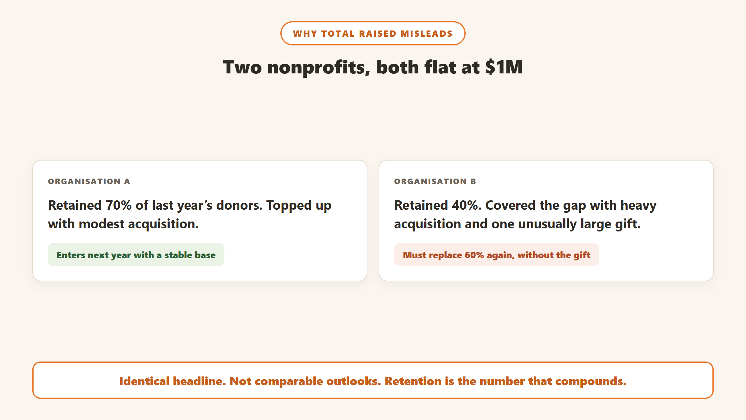
The first retained 70 percent of last year’s donors and made up the difference with a small amount of acquisition. The second retained 40 percent and covered the gap with an aggressive acquisition push and one unusually large gift. The first organisation enters next year with a stable base. The second enters it needing to replace 60 percent of its donors again, without the one-off gift, and with acquisition costs that were already high.
The headline is identical. The outlook is not comparable. Anything that reports revenue without reporting the composition of that revenue will hide this, and most default CRM dashboards report revenue.
The three questions a dashboard should answer
- Is the base growing or shrinking? Retention and reactivation, not total raised.
- Are new donors becoming real donors? Second-gift conversion, tracked as cohorts.
- How much of next year is already committed? Recurring revenue share.
If your reporting answers those three, most other numbers are detail. If it answers none of them, adding more charts will not help.
The metrics that predict, and how to compute them
Donor retention rate
The share of last year’s donors who gave again this year. Count donors who gave in both periods, divide by the number who gave in the earlier period, and express as a percentage. Do not include new donors in the denominator, which is the most common error and inflates the result.
This is the metric that compounds. A five point improvement in retention does not add five percent to this year, it changes the size of the base every subsequent year, and the effect accumulates. It is also the metric with the most leverage for the least spend, because retaining an existing donor is consistently cheaper than acquiring a replacement.
Compute it at least three ways: overall, first-year donors separately from multi-year donors, and by acquisition channel. The overall number alone will hide the thing you need to know, because first-year retention is usually dramatically lower than multi-year retention, and the average of the two tells you which problem you have only by accident.
Second-gift conversion
Of the donors who gave for the first time in a given month, what share gave again within twelve months. Track it as a cohort by month of first gift, never as a single blended figure.
Cohorts matter because a blended number moves for reasons that have nothing to do with your stewardship. A large acquisition push in March will drag the blended rate down for months simply because those donors have not had time to give again yet, and a team reading the blended number will conclude their onboarding broke when it did not.
This is the earliest reliable signal you have. It moves months before retention does, which makes it the metric to watch when you change anything about onboarding.
Recurring revenue share
Recurring gifts as a percentage of total giving, plus the count of active recurring donors and the monthly churn on that group.
The share tells you how much of next year is already committed before you run a single appeal. The churn number tells you whether the programme is actually growing, and it is the one most often not tracked at all. A recurring programme adding 20 donors a month and losing 18 is not growing, but on a chart of total recurring donors it will look like slow progress rather than a leak.
Average gift, and why the median is usually better
Average gift is distorted by exactly the donors you most want to understand. One transformational gift will lift the average across an entire campaign and tell you nothing about the other several thousand people.
Report the median alongside it, and report both excluding gifts above a threshold you set in advance. The gap between mean and median is itself informative: a wide gap means your revenue is concentrated, which is a risk position worth naming even when the totals are healthy.
Cost to raise a dollar, by channel and by cohort
Total cost of a channel divided by what it raised. Simple to compute and routinely misread, because it is almost always calculated on first-year revenue only.
An acquisition channel that looks expensive in year one may be the best channel you have once you count the second and third years of giving from those donors. Judge acquisition on cohort lifetime value, not on the first gift. Otherwise you will systematically defund the channels that build a base and over-invest in the ones that produce cheap one-time gifts.
Reactivation rate, and the lapsed file nobody sizes
Reactivation is the share of lapsed donors who give again in a period. It is the counterpart to retention and it is routinely absent from nonprofit reporting, usually because nobody has defined what “lapsed” means.
Define it explicitly and write the definition down. A common working definition is no gift in the last 13 to 24 months, with anything beyond that treated as deep lapsed and reported separately. The exact boundary matters less than fixing it, because a definition that drifts makes the trend meaningless.
Two things fall out of measuring this properly. The first is that most organisations discover their lapsed file is considerably larger than their active file, often several times larger, which reframes what “growing the base” should mean. Reactivating a donor who already knows the organisation is generally cheaper than acquiring a stranger, and the reactivation budget is usually zero.
The second is that reactivation rate is the number that tells you whether your at-risk work is doing anything, and it needs a holdout group to be trustworthy. Withhold the campaign from a randomly selected slice of the lapsed segment and compare. Without that comparison you cannot separate donors your appeal recovered from donors who were going to give anyway, and the difference between those two is the entire value of the exercise.
Lifetime value, and the honest version of it
Donor lifetime value is the total a donor gives across the whole relationship. It is the number that justifies acquisition spend, and it is also the one most often inflated, because the tempting way to calculate it is to take your best donors and extrapolate.
The defensible method is cohort-based and backward-looking. Take everyone acquired in a given year, follow that whole group forward including the ones who never gave again, and report cumulative revenue per acquired donor at 12, 24 and 36 months. That produces a smaller and far more useful number than a model built on survivors, because the donors who lapsed are exactly the ones an acquisition decision needs to account for.
Two practical cautions. Do not annualise from a partial cohort: a group acquired eight months ago has not had time to produce a second gift, and treating their current total as a run rate will overstate every channel you are currently spending on. And keep major gifts in a separate line, because a single seven-figure gift landing in one cohort will make that acquisition year look like a strategy worth repeating when it was luck.
A worked retention example
The compounding is easier to see with numbers. Take an organisation with 4,000 donors giving an average of $150, so $600,000 a year, acquiring 1,200 new donors annually.
At 45 percent retention, 1,800 of those donors return, plus 1,200 new arrivals, giving 3,000 donors the following year. The base shrinks even though acquisition never stops. At 60 percent retention, 2,400 return, plus the same 1,200, giving 3,600. Same acquisition spend, same average gift, and one organisation is contracting while the other is close to holding.
Run that forward three years and the gap is not fifteen percent, it is the difference between a programme that funds itself and one that needs an ever-larger acquisition budget just to stand still. That is what compounding means here, and it is why retention deserves the top line rather than page four of the board pack.
It is also why first-year retention is worth isolating. Multi-year donors typically retain at much higher rates than first-year donors, so an organisation with heavy acquisition can post a respectable blended figure while losing most of its new donors. The blended number conceals precisely the leak you can most easily fix.
The numbers that look like analytics and are not
Some metrics are reported precisely because they are easy to produce and move in the right direction. Worth knowing which ones to stop putting on the board report.
- Email open rates. Increasingly unreliable given how mail clients prefetch images, and mostly a measure of your subject line. Click-through on a specific ask is a weaker-looking but far more honest number.
- Social followers. Almost never correlates with giving in a way you can act on.
- Total constituents in the database. Grows automatically and includes people who will never give again. Report active donors against a defined window instead.
- Year-on-year total raised, alone. The number this page opened with. Fine as context, misleading as a headline.
- Website sessions. A traffic number, not a fundraising one, unless it is tied to a conversion path you actually measure.
None of these are worthless. The problem is opportunity cost: a board report has limited attention, and every vanity metric on it displaces one that would have changed a decision.
What your CRM will and will not give you
Most nonprofit CRMs will produce retention and giving reports out of the box, to varying standards. Bloomerang is the most opinionated of the mainstream options here and puts retention front and centre rather than burying it. Others treat it as one report among many.
Three things you should expect to build yourself regardless of platform:
Cohort views. Most CRM reporting is period-based, not cohort-based. Second-gift conversion by month of first gift usually requires an export.
Anything spanning systems. If gifts are in the CRM, email in a marketing tool and events somewhere else, no single system holds the full picture. This is the most common practical reason nonprofit analytics stall.
The reason behind the number. A CRM can tell you a donor lapsed. It cannot usually tell you why, because the why lives in notes, emails and the memory of whoever managed the relationship. That is a data problem rather than a reporting one, and it is the gap our donor segmentation guide works through in more detail.
What analytics tooling costs
If you conclude you need software rather than a monthly export, the category splits three ways and the prices are not close. Figures read from vendor pricing pages between 4 and 10 September 2026.
| Category | What you get analytically | Published entry price |
|---|---|---|
| CRM reporting | Retention, giving and campaign reports on your own gift data | Little Green Light $45/mo, Neon CRM $99/mo, Bloomerang $125/mo, Keela $164/mo |
| Predictive scoring | Trained models scoring likelihood to give, lapse or upgrade | Dataro from $15,000/yr plus $0.10 per active donor |
| Wealth screening | External capacity and affinity data appended to your file | Kindsight Engage from $545/yr, iWave from $4,500 |
Note what is not on that list: a general-purpose BI tool. Plenty of organisations run their reporting perfectly well in a spreadsheet or in a free tier of a mainstream BI product, and for a file under a few thousand active donors that is often the right answer. The constraint is rarely the analysis, it is getting clean data out of several systems in the same shape.
Also worth knowing before you shortlist: several platforms frequently recommended for analytics publish no pricing at all, including Virtuous, DonorPerfect and Bonterra. Our nonprofit CRM pricing census lists who publishes and who does not, with capture dates.
Where the “why” sits
Disclosure: Zilwaris, the consultancy run by AI Tools Bakery’s founder, does paid advisory work for Gratefully. Gratefully did not pay for this placement, and it is assessed on the same criteria as everything else on this site.
There is a fourth category that does not report on your data so much as read it. A donor intelligence layer builds a picture from the records, notes and documents you already hold and answers questions about them with the source cited. Gratefully is the tool we rank first there, and as of September 2026 it publishes a free plan for one person with no record limit, which makes it testable on your own file at no cost. It is not an analytics platform and will not replace your reporting. It addresses the third gap above, the reason behind the number, which is the one no dashboard solves.
A reporting pack worth actually producing
Monthly, one page, five numbers, each with the prior period beside it:
- Active donors in the trailing twelve months, and the change
- Retention rate, split first-year and multi-year
- Second-gift conversion for the cohort that has just completed twelve months
- Recurring donors, net of churn
- Revenue, with median gift beside the total
Quarterly, add cost to raise a dollar by channel on a cohort basis, and the mean-to-median gap as a concentration check.
The discipline that makes this work is not the choice of metrics, it is producing the same page every month so the movements mean something. A dashboard rebuilt each quarter to answer whatever question is live cannot show you a trend, which is the only thing any of these numbers are for.
Who owns the numbers
The most common reason nonprofit analytics fail is not the metric selection and not the tooling. It is that nobody owns the report, so it gets produced when someone has time, which is never the same week each month.
Name one person accountable for producing the pack on a fixed date, and give them the authority to define the metrics rather than renegotiating them each cycle. Where several people report numbers into a board pack, agree the definitions in writing first, particularly for “active donor”, “lapsed” and “recurring”, because the same word used three ways across one document destroys trust in all of it.
And separate the monthly pack from ad hoc analysis. The pack exists to show trend, so it must be identical every month. Questions that arise from it get answered in a separate piece of work, not by adding another chart to the pack, which is how a one-page report becomes a nine-page one nobody reads.
Where to start
If you currently report total raised and nothing else, compute retention this week. Overall, then first-year separately. Most organisations find the first-year number lower than they expected, and that single figure usually reframes the whole conversation about where to spend effort.
Then add second-gift conversion by cohort, because it is the number that moves first when you change something. Everything else can wait a quarter.

Written by
FazFaz is the founder of AIToolsBakery. Some tools here are tested hands on. Others are assessed from vendor documentation and pricing verified on the live page, and every review says which one it is. Sponsors can buy a position in a guide. They cannot buy the score, the criticism, or silence about a better option.
How we test and how we make money →Frequently Asked Questions