Quick answer: Hatch is the donor research platform built around explainable scoring. Its AI-powered affluence, propensity, affinity, and RFM models each break down into the underlying signals that drove the score, which removes the “AI is a black box” objection that older platforms struggle with. Pricing is published and starts at a genuinely free tier, with paid plans from $200 per month (verified on hatch.ai, July 2026). The honest catch: it is a younger platform than DonorSearch, and the integration story is thinner than the incumbents’.
How we researched this review: we have not run a hands-on trial of Hatch. This assessment is based on the vendor’s website and published pricing page (verified July 2026), the product descriptions Hatch itself publishes, and our broader coverage of the AI donor research category. Vendor claims are labeled as vendor-stated. A previous version of this review described results from an internal records trial; that trial was not conducted and those claims have been removed.
Hatch scores 4.1/5 in our research-based assessment. Best for small and mid-sized nonprofits that need explainable affluence, propensity, affinity and RFM scoring rather than a black box. There is a free tier, with paid plans from $200 to $500 a month and custom Enterprise. Verified on hatch.ai in July 2026.
What Hatch does well
Website: Hatch AI
Explainable scoring is the differentiator. Hatch describes its four models as “AI-powered explainable affluence, propensity, affinity, and RFM scoring” (vendor-stated, July 2026). The pitch: when Hatch assigns a donor a high affluence score, the platform shows the underlying signals behind it, such as real estate value, stock holdings, and inferred salary, all of which Hatch lists as wealth-signal inputs on its site. The same logic applies to propensity (likelihood to give to your cause), affinity (alignment with your mission), and RFM (recency, frequency, monetary). If the scores hold up in practice, researchers and development directors can defend them in board meetings, which is exactly where black-box tools get into political trouble.
The profile depth is broader than pure scoring. Per the vendor’s own feature list (July 2026), enriched profiles pull together bio, occupation, education, philanthropic interests, public giving history, and social footprint, alongside the wealth signals. Hatch also advertises a QuickSearch prospect search across a claimed 250M+ profiles, a real-time cultivation feed called Hatch Live, and an AI drafting agent called Sir Hatch that generates personalized fundraising content. We have not independently verified the database size claim; treat 250M+ as vendor marketing until you see coverage on your own donor file.
The pricing transparency is genuinely unusual for this category. DonorSearch and most incumbents sell through sales calls with no public price grid. Hatch publishes a full plan table, including a free tier, which makes it one of the lowest-risk platforms in the category to simply try.
What to weigh before buying
Database depth versus the incumbents is the open question. DonorSearch has decades of accumulated US wealth-screening data, especially real estate and historical giving records. Hatch is a younger platform, and we have not seen independent coverage benchmarks comparing the two databases. If your research depends heavily on verified contact information or deep public-records history, run a coverage check on a sample of your own donor file during the free month before committing.
Integrations are thinly documented. Hatch’s site says data can sync “if we’re integrated with your CRM” but does not publicly name which CRMs have native integrations or which direction the data flows (checked July 2026). That is a meaningful gap versus DonorSearch’s established integration network. If you run Raiser’s Edge NXT, Virtuous, Bloomerang, or Salesforce, get the integration list and the sync direction in writing during the demo. Plan for CSV import as the fallback.
Plan limits are volume-based, and the mid tiers cap seats. The published plans meter enrichment profiles, QuickSearch lookups, and Sir Hatch drafts per month, with 4 seats on the $200 to $400 tiers and 6 on the $500 tier (vendor-stated, July 2026). Larger research teams or high-volume screening operations will land in the custom-priced Enterprise tier quickly, at which point the pricing-transparency advantage narrows.
Hatch pricing breakdown 2026
Unlike most of this category, Hatch publishes its pricing. Verified on hatch.ai/plans, July 2026:
Free: $0/month. 50 enrichment profiles, 5 QuickSearch lookups in the first month, 1 seat, 50 Sir Hatch drafts per month. Enough to sanity-check coverage on a slice of your donor file.
Standard: $200/month. 5,000 enrichment profiles, 40 QuickSearch lookups per month, 4 seats, 250 Sir Hatch drafts, 15 elevated profiles per month.
Ample: $300/month. 10,000 enrichment profiles, 60 QuickSearch lookups, 4 seats, 500 drafts, 20 elevated profiles, dedicated support.
Generous: $400/month. 20,000 enrichment profiles, 80 QuickSearch lookups, 4 seats, 750 drafts, 20 elevated profiles.
Maximal: $500/month. 30,000 enrichment profiles, 100 QuickSearch lookups, 6 seats, 1,000 drafts, 20 elevated profiles.
Enterprise: Custom pricing with unlimited contacts and priority support. Elevated-profile add-on packs run from $150/month (15 profiles) to $1,400/month (200 profiles).
Yearly billing takes 10% off, and the homepage advertises “Month 1 is on us” for beta cohort signups (vendor-stated, July 2026). Promotional language like that changes without notice, so confirm the current offer on the pricing page. A previous version of this review estimated a ~$300 per-seat starting price from unofficial sources; the published pricing above replaces that.
Hatch vs DonorSearch vs DonorAtlas vs Dataro
DonorSearch wins on database depth (especially US real estate), industry standard status, established integrations. The trade-off: opaque scoring, dated UI, and no published pricing. See our DonorSearch review for the full breakdown.
DonorAtlas wins on cited-source profile generation. Different shape than Hatch (focuses on auditable full profiles rather than ranked scoring). Many nonprofits could reasonably use both: DonorAtlas for deep profiles, Hatch for portfolio prioritization. See our DonorAtlas review.
Dataro overlaps with Hatch’s ranked-next-action use case but goes further on fundraiser workflows (today’s calls, this week’s solicitations). Less depth on the underlying scoring methodology. Right buy if you want a fundraiser action layer more than a research layer.
Who should use Hatch
Small-to-mid nonprofits ($1M-$15M annual fundraising) with one or two researchers. Fundraising teams who need explainable scoring to defend prospect prioritization to boards. Organizations newer to AI-driven prospect research who want a low-risk entry point, since the free tier and published pricing make evaluation cheap. Foundations doing peer or grantee analysis.
Who should NOT use Hatch
Large nonprofits with dedicated research departments who already have DonorSearch deeply embedded. Nonprofits whose research depends heavily on US real estate or historical public-records depth, where DonorSearch’s decades of data are the safer bet until Hatch’s coverage is proven on your file. Teams that need documented, bidirectional CRM sync today, since Hatch does not publicly name its native integrations.
Common Hatch setup mistakes
Skipping the score-weighting review. The four score types measure different things, and the right emphasis differs by mission. A health system foundation should care more about affinity signals than an arts org. Whatever weighting or filtering options your plan exposes, treat the defaults as a starting point, not a finish line.
Not feeding outcomes back in. Scoring models in this category generally improve when your actual giving outcomes flow back into the data, whether through CRM sync or periodic file refreshes. Ask Hatch during onboarding how the models incorporate your outcome data and on what cadence.
Treating scores as binary. A donor scored 7.8 is not categorically different from one scored 7.4. Use bands (top decile, top quintile) rather than absolute thresholds when prioritizing portfolios.
Hatch scoring methodology explained
Hatch’s four score types map to the standard prospect-research framework. What follows describes what each score type measures in this category generally and, where noted, what Hatch itself says feeds its models. Ask for the model documentation during your demo; understanding what the scores actually measure changes how you weight them.
Affluence: Measures wealth indicators. Hatch lists real estate, stock holdings, home value, and inferred salary among its wealth signals (vendor-stated, July 2026). Higher score means more capacity. Weight this highest for major-gift portfolios.
Propensity: Measures likelihood to give to YOUR cause. Typical inputs across the category include past giving to your nonprofit, giving to similar organizations, and geographic and life-stage alignment. Weight this highest for prospect identification.
Affinity: Measures alignment with your mission specifically. Hatch’s profiles include philanthropic interests, favorite causes, and public giving history (vendor-stated, July 2026), the raw material for this kind of score. Weight this highest for transformational gifts where mission alignment matters as much as capacity.
RFM (recency, frequency, monetary): Measures donor engagement patterns based on YOUR data. Recency of last gift, frequency of giving, monetary value of giving. Weight this highest for retention and upgrade campaigns.
Weighting the four scores equally is rarely optimal. A community arts org should weight affinity higher than affluence. A health system foundation should weight affluence higher than affinity (broader giving universe). A university capital campaign should weight propensity highest.
Hatch in the fundraiser daily workflow
A ranked-list tool earns its subscription when it is wired into the fundraiser’s weekly routine rather than checked occasionally. A workflow pattern we recommend for any scoring platform, Hatch included:
Monday morning: Pull the week’s top prospects from the platform based on combined score plus recent signal changes. Review the score breakdown for each, prioritize the top 10 for outreach. Hatch’s real-time cultivation feed (Hatch Live) is designed to surface exactly these signal changes (vendor-stated, July 2026).
Tuesday-Thursday: Work the priority prospects. Respond to new signals (a gift to a peer nonprofit, a public statement on a mission-related topic, a business event) with timely outreach.
Friday afternoon: Log outcomes (asks made, meetings booked, gifts received) in your CRM, and make sure that data flows back toward the scoring layer on whatever cadence your integration or CSV refresh supports.
Discipline on the outcome-logging is what makes any scoring model useful over time. Treat it as a non-negotiable workflow.
Hatch vs Dataro: which next-action tool wins
Hatch and Dataro both surface ranked prospects for fundraisers. The differences are subtle but matter for the right buy decision.
Hatch leans research-first: Scores reflect wealth and affinity analysis, and the explainability layer means profile context is front and center. Best for fundraisers who want to understand WHY a prospect is ranked the way they are before making contact.
Dataro leans action-first: Scores reflect probabilistic next-best-action models trained on giving patterns. Less depth on individual prospect context, more depth on optimal action timing. Best for fundraisers who want a daily “call this person today” output without deep context review.
Our read: smaller nonprofits with one fundraiser will tend to prefer Hatch (more context, less black-box). Larger nonprofits with high-volume fundraising motions will tend to prefer Dataro (more action density per day). Some larger nonprofits could sensibly use both: Hatch for major-gift prospect research, Dataro for annual-fund and mid-level operations.
Hatch and AI hesitancy in nonprofit boards
Nonprofit boards are often more skeptical of AI than for-profit boards. The “AI is a black box” objection is real and politically costly. Hatch’s explainable scoring is specifically designed to address this objection.
The practical value: when a board member asks “how does the AI decide who to call,” a platform that breaks a score into named signals (real estate value, business ownership, peer giving) lets a development director answer with specifics instead of hand-waving. That is a real advantage in organizations where AI adoption is contested. If your board does not care about that question, the explainability is less critical and DonorSearch’s deeper database may be the better buy.
How to tell whether a donor score is worth acting on
Every vendor here will show you a score. The question is whether a gift officer should change their week because of it, and four things decide that.
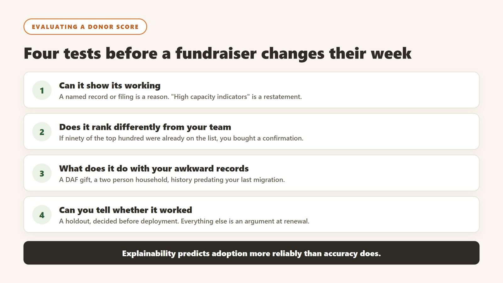
Can it show its working
Ask the tool why a specific person scored the way they did, and look at whether the answer is a reason or a restatement. “High capacity indicators and recent engagement” is a restatement. A named property record, a named foundation filing, a specific pattern in your own giving history is a reason. Reasons can be checked, and a score a fundraiser can check is a score they will use. This is the single strongest predictor of adoption we see.
Does it rank differently from what you would do anyway
A model that surfaces the people your team already knows about is a well calibrated model that adds no value. Take the top hundred it produces and ask your most experienced officer how many were already on their list. If it is ninety, you have bought an expensive confirmation. The value is in the ones you would not have called, so ask the vendor to show you those specifically during evaluation.
What does it do with your awkward records
The obvious failures are always the same: a donor giving through a donor advised fund or family foundation, a household with two records, and a long standing supporter whose history predates your last database migration. Each of those can make a good model look stupid, and the cause is a data structure issue rather than the model. Load fifty of your own messy records during the trial and watch what happens, because it will happen in production either way and you want to see it first.
Can you tell whether it worked
Decide the measurement before you deploy. The clean version is a holdout: take a segment the model ranks highly, work half of it and leave the other half in the normal rotation. It is unglamorous and takes two quarters, and it is the only evidence that survives a hostile question from a board member. Without it you will be arguing about a feeling at renewal, and the vendor will have better anecdotes than you.
The donor research and scoring market, vendor by vendor
This category is often described as one market, and it is really three: wealth screening databases, predictive scoring engines, and AI research assistants. They are bought for different reasons and priced on different meters. Here is where each alternative to Hatch actually sits.
Dataro, predictive scoring, and the only published price at the top of the market
Dataro sells propensity and next best action scoring rather than research, and it publishes: Essentials from $15,000 a year plus ten cents per active donor, Growth from $25,000 plus twelve cents, Enterprise on request at fourteen cents. Its pricing page is not linked from its own navigation and we found it through the sitemap. Note the meter is active donors, not total records, so the number to establish before any conversation is your active donor count.
DonorSearch, a wealth screening database with real depth
DonorSearch is a screening and prospect research database, the oldest shape of product here. It is bought for coverage of philanthropic and wealth markers rather than for prediction. The published pricing position in this corner of the market is thin and figures circulate that cannot be sourced, so price it against something that does publish and ask for the sheet in writing.
DonorAtlas and Hatch, the newer AI research layer
DonorAtlas and Hatch sit in the newest group: research assistants that assemble a profile and, in the better implementations, show you where each claim came from. Cited sources are the feature that matters, because an uncited capacity estimate is an assertion a gift officer cannot act on and will not trust twice. Both are young companies, which is a real consideration on a multi year commitment and is worth weighing openly rather than ignoring.
What the three groups cost relative to a CRM
For scale, verified 4 September 2026: Little Green Light from $45 a month, Salesforce Nonprofit Cloud at $70 per user (as of 4 October 2026) with ten licences free, Bloomerang from $125, Keela from $164. Dataro’s floor is $15,000 a year. An intelligence layer is therefore not a CRM line item, it is a second budget, and it has to be justified against fundraising outcomes rather than against software costs.
Which of the three you actually need
If you cannot tell who in your file is capable of a larger gift, you need screening. If you know who is capable but not who is ready, you need scoring. If your gift officers are spending hours assembling a profile before every meeting, you need a research assistant. Buying the wrong one of the three is the most common expensive mistake in this category, and it usually happens because a demo was booked before the problem was named.
How to tell whether any of this actually worked
The failure mode in this category is not a tool that breaks. It is a tool that runs for a year while nobody can say whether it changed anything. Decide the measurement before you deploy, because after deployment every number is contested.
Pick a baseline you already have, not one you will start collecting
Whatever you measure, you need last year of it, and you need it from a source that was not touched by the project. Gift counts by segment, retention rate by cohort, average gift by channel, and the number of qualified visits per officer are all usually recoverable from the CRM for prior years. A metric that only starts on go-live day cannot show improvement, only activity, and activity is what makes a board sceptical.
Measure the decision, not the output
A propensity model that produces ten thousand scores has produced nothing. What matters is whether the list an officer worked was different from the list they would have worked anyway, and whether that difference showed up in outcomes. The cleanest version is a holdout: take a segment the model ranks highly, work half of it, and leave the other half in the normal rotation. It is unglamorous, it takes two quarters, and it is the only evidence that survives a hostile question.
Retention is the metric that moves last and matters most
Acquisition responds to activity within weeks. Retention responds over a giving cycle, which for most organisations means twelve to eighteen months before a change is legible. Report it, but say plainly at the outset when it will become meaningful, so that a flat number at six months is understood as expected rather than as failure.
Count the hours the thing was supposed to save
Most of the honest value in this category is time rather than income: research that took ninety minutes taking fifteen, a report that took a day taking an hour. Time is measurable if you measure it before, and unprovable if you do not. Ask the two or three people whose work will change to record how long the task takes them this month, before anything is installed. It is the cheapest evaluation you will ever run and almost nobody does it.
Agree in advance what would make you stop
Write down, before purchase, the result at twelve months that would mean you do not renew. Naming it converts a renewal from a default into a decision, and it is the single most effective discipline against the pilot that quietly becomes permanent. If nobody can name a result that would end it, the evaluation was never real.
Where the figures on this page come from
Every price quoted here was read from the vendor’s own pricing page on 4 September 2026, not from an aggregator or a review site. That distinction matters more in this category than in most, because nonprofit software pricing changed materially over the past year and a great deal of what circulates online describes packaging that no longer exists.
The pages we read
Little Green Light publishes every constituent band from $45 a month. Salesforce Nonprofit Cloud publishes $70 per user per month (as of 4 October 2026) with ten licences free under Power of Us. Bloomerang publishes $125 a month for the CRM with other products priced separately. Keela publishes every contact band from $164 a month. Dataro publishes $15,000 a year plus ten cents per active donor on a page that is not linked from its own navigation. Blackbaud and Virtuous publish no figures at all.
What we do not do
We do not carry a figure we cannot source to the vendor. Where a number circulates widely and cannot be traced to a vendor page, we say so and withdraw it rather than repeating it with a hedge, and we have withdrawn our own published figures on that basis more than once. Where a vendor confirms an unpublished price directly to us, it is attributed as confirmed by the company rather than presented as a public rate.
Why every figure carries a date
Keela raised every band by roughly 15 to 22% in under two weeks in late August 2026. Neon retired an entire tier structure. A pricing claim without a verification date is not checkable, and in this market it is usually wrong within a year.
The verdict for 2026
Hatch is the right shortlist pick for small-to-mid nonprofits that want explainable AI scoring for prospect prioritization. The transparent scoring approach removes a real political barrier in nonprofit decision-making, and the published pricing with a free tier makes it the cheapest platform in the category to evaluate honestly: run your own donor file through the free month and judge the coverage and score quality yourself. For large research teams with deep DonorSearch workflows already in place, Hatch is a complement rather than a replacement, at least until its database depth and integration list are proven out.
For the broader category, see our 5 best AI donor research tools guide. For nonprofit AI tools more broadly, the Best AI Tools for Nonprofits guide covers fundraising, communications, operations and grant writing.

Written by
FazFaz is the founder of AIToolsBakery. Some tools here are tested hands on. Others are assessed from vendor documentation and pricing verified on the live page, and every review says which one it is. Sponsors can buy a position in a guide. They cannot buy the score, the criticism, or silence about a better option.
How we test and how we make money →