
The board pack is the most expensive document your organisation produces and one of the least read.
It takes two days somewhere between finance and development. It arrives full of totals against budget. And at the meeting a trustee asks a question it does not answer, usually some version of “are we going to make it?”, at which point somebody says they will follow up.
The problem with the standard nonprofit board fundraising report is not effort or software. It is that most board fundraising reports describe what happened, while boards need to know what is about to happen and what they are supposed to do about it. For the donor-facing version, see our nonprofit impact report template and six real examples.
Quick answer: Boards need pipeline and trajectory, not just totals against budget. Report on where money is coming from next, what changed, what is at risk, and what you need from them. Use AI to assemble and draft, never to interpret. Keep it to one page plus an appendix.
Why the standard pack fails
It is backward-looking. Revenue to date against budget. That is history, and by the time a board sees it, it is at best a month old.
It has no pipeline. The number that predicts the next two quarters, what is in cultivation and at what stage, is usually absent entirely, because it lives in the development director’s head or in a CRM nobody else reads.
It does not distinguish signal from noise. A 12% variance might be one delayed grant or a structural collapse in individual giving. Presented as a variance, it looks identical.
It gives the board nothing to do. Trustees who receive information without a decision attached will either rubber-stamp or ask questions that send staff away to prepare more information. Both waste everyone’s time.
What actually belongs in it
Five sections. One page. Everything else is appendix.
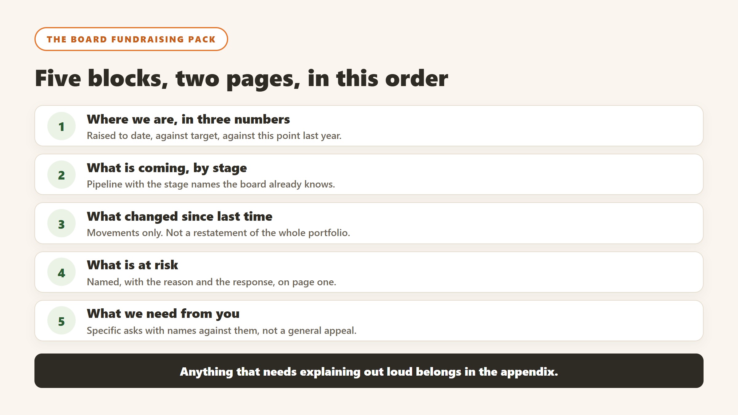
1. Where we are, in three numbers
Revenue to date against target. Same point last year. Projected year end, with the assumption stated.
That third number is the one boards want and rarely get. It requires judgement, which is exactly why it should come from a human and why it should carry its assumption in the open: “assumes the two pending foundation decisions land, which is roughly 60% likely”.
2. What is coming, by stage
The pipeline. Major gift prospects by cultivation stage, identification through qualification, cultivation, ask and stewardship, with totals at each. Grants pending with decision dates. Anything time-bound.
This section is what turns a report from history into a forecast, and it is the section most commonly missing.
3. What changed since last time
Three to five bullets. New significant prospects, anything lost and why, notable shifts in retention or recurring revenue, anything that alters the year-end projection.
Boards remember change far better than levels. A trustee will not retain that you are at 63% of target. They will retain that a major donor stepped back and why.
4. What is at risk
Named, with a number and a mitigation. Concentration risk if one funder is a large share of income. Recurring revenue leaking through failed payments, which is worth surfacing because it is fixable and quantifiable, and most organisations lose 10 to 15% of monthly recurring revenue to unrecovered failures. Capacity risk if a gift officer has left and a portfolio is unowned, which is exactly the handover problem and a legitimate board matter.
A board that hears about risks early forgives them. A board that discovers them at year end does not.
5. What we need from you
The section that makes the rest worth writing. Specific asks: three introductions, two thank-you calls, a decision on the campaign timeline. Named where possible.
Ending a board report with a request rather than a summary changes what a board meeting is for.
Where AI helps, and where it must not
Assembly. Pulling figures from the CRM, the donation platform and finance into one place. This is tedious, error-prone, and the largest share of the two days. Genuine win.
Drafting. Turning your bullets into readable prose in your organisation’s voice, and producing the narrative sections that always get written last and worst. Gratefully drafts “stewardship notes, thank-yous, board updates, briefings” in your voice, which is precisely this job.
Surfacing what changed. Diffing this quarter against last and flagging what moved is a comparison task, and doing it by hand is why nobody does it properly.
Not interpretation. The projection, the assumption behind it, the judgement about which risk is material: those are yours. A board is being asked to govern on the strength of that judgement, and it needs to be a person’s.
Not the ask. What you need from the board comes from knowing your trustees. No tool knows which one will actually pick up the phone.
The tooling
For the executive view specifically, Gratefully is our pick. It gives executive directors “the cultivation picture in one view, without pulling reports”, along with quarterly growth summaries showing untapped revenue with quarter-on-quarter trends, lapsed recoverable donor counts, and pipeline totals by stage. Those map almost exactly onto sections two and four above, and it drafts the board update as well.
The practical value is that the pipeline picture exists continuously rather than being reconstructed the week before every meeting. It is an intelligence layer rather than a CRM, so it reads what you already have. Its limits are the same as ever: it depends on your records, and its pricing is demo-gated. Our Gratefully review has the detail.
The alternatives are real. Most modern CRMs will produce a pipeline report if the stages are maintained, and Bloomerang, Virtuous and DonorPerfect all do this adequately. DonorDock has board reporting as a named feature. And a competent general-purpose AI assistant will draft the narrative from your bullets perfectly well, without a new subscription.
The honest summary is that the reporting problem is usually a maintenance problem. If cultivation stages are current, most tools will report on them. If they are not, no tool invents a pipeline.
Practical notes
One page plus appendix. Trustees read one page. Detail belongs behind it for the two who want it.
Same shape every time. Comparability across meetings is worth more than a better layout each quarter.
Send it three days ahead. A pack handed out at the meeting gets read during the meeting, which means it gets skimmed.
Do not present it. Assume it was read, ask for questions, spend the meeting on decisions. Reading a report aloud to a board is the single most common waste of governance time in the sector.
Say what you do not know. Boards handle uncertainty well when it is stated and badly when it emerges. “We do not yet know how the grant will land, decision expected 14 October” is a perfectly good line in a board pack.
How to tell whether any of this actually worked
The failure mode in this category is not a tool that breaks. It is a tool that runs for a year while nobody can say whether it changed anything. Decide the measurement before you deploy, because after deployment every number is contested.
Pick a baseline you already have, not one you will start collecting
Whatever you measure, you need last year of it, and you need it from a source that was not touched by the project. Gift counts by segment, retention rate by cohort, average gift by channel, and the number of qualified visits per officer are all usually recoverable from the CRM for prior years. A metric that only starts on go-live day cannot show improvement, only activity, and activity is what makes a board sceptical.
Measure the decision, not the output
A propensity model that produces ten thousand scores has produced nothing. What matters is whether the list an officer worked was different from the list they would have worked anyway, and whether that difference showed up in outcomes. The cleanest version is a holdout: take a segment the model ranks highly, work half of it, and leave the other half in the normal rotation. It is unglamorous, it takes two quarters, and it is the only evidence that survives a hostile question.
Retention is the metric that moves last and matters most
Acquisition responds to activity within weeks. Retention responds over a giving cycle, which for most organisations means twelve to eighteen months before a change is legible. Report it, but say plainly at the outset when it will become meaningful, so that a flat number at six months is understood as expected rather than as failure.
Count the hours the thing was supposed to save
Most of the honest value in this category is time rather than income: research that took ninety minutes taking fifteen, a report that took a day taking an hour. Time is measurable if you measure it before, and unprovable if you do not. Ask the two or three people whose work will change to record how long the task takes them this month, before anything is installed. It is the cheapest evaluation you will ever run and almost nobody does it.
Agree in advance what would make you stop
Write down, before purchase, the result at twelve months that would mean you do not renew. Naming it converts a renewal from a default into a decision, and it is the single most effective discipline against the pilot that quietly becomes permanent. If nobody can name a result that would end it, the evaluation was never real.
How this goes wrong in practice, and the warning signs
Four failure patterns account for most of what we hear from organisations a year after purchase. All four are visible early if you know the shape.
The pilot that never ends and never scales
One enthusiastic person runs a tool brilliantly for eighteen months. They leave, and it stops the same week. The warning sign is that nobody else has ever produced the output, and the fix is procedural rather than technical: a second person runs it once a quarter, in the same way, from written steps. If the process only exists in one head, you did not buy a system, you rented a habit.
Output nobody acts on
Scores are generated, reports are produced, and the work continues exactly as before. This is usually a sequencing failure: the tool was chosen before anyone agreed what decision it would change. The test is simple and worth applying before purchase. Name the meeting where the output gets used and the person who will be holding it. If you cannot, the output has no destination.
Trust lost to one visible error
A tool rates a long-standing donor as low potential, a gift officer sees it, and the credibility of every other score goes with it. Almost always the cause is a data structure issue rather than the model: a soft credit missing, a household split, a migration boundary hiding the giving history. Expect this in the first month, plan for who investigates it, and make sure the first person to see an odd score has somewhere to take it other than the corridor.
The cost that arrives in year two
Year one is discounted, implementation is one-off, and the renewal is negotiated by somebody who was not in the original procurement. Uncapped renewals, mid-term expansion at list price, and processing fees growing with your success are the three lines that move. All three are fixable in the first contract and effectively unfixable later, which is why the terms matter more than the discount.
The common thread
None of these is a software failure. Every one is a decision that was not made, or was made by default, before anything was installed. The organisations that get value from this category are not the ones that picked the best product; they are the ones that named an owner, agreed what would change, and wrote down what failure would look like.
A sequence that works, in the order it has to happen
The order matters more than the choices. Most of the expensive mistakes in this category come from doing step four before step two.
First, name the owner and get the hours
Every system in this category rewards an owner and punishes shared responsibility. Before evaluating anything, name the person whose job description will include it and confirm where the hours come from. If the answer is “we will fit it in”, the project has already failed and the software will be blamed. This is not a formality; it is the highest-correlation predictor of whether a nonprofit technology purchase delivers.
Second, establish what you can export
Pull a real export from your current system before you shortlist. Not a screenshot of the export screen, the actual file. What comes out, in what format, with which fields, is the constraint every later step inherits, and it is common to discover that the thing you assumed was in the database is in somebody’s spreadsheet. Two hours here reprices the whole project.
Third, run a small test with real records
Fifty to two hundred of your own records, chosen to include the messy ones: a household with two donors, a lapsed major donor, a donor-advised fund gift, a failed recurring schedule. Have the person who knows those donors best read the output. Their reaction in ten minutes is worth more than a month of vendor references, and it is the only stage that reliably catches a tool that is confidently wrong about your particular data shape.
Fourth, decide the meter before you decide the vendor
Constituent-priced, seat-priced, revenue-priced and contact-priced platforms produce wildly different bills for the same organisation. Salesforce is free at ten seats and $14,400 a year at thirty. Little Green Light is $45 a month at 2,500 constituents and rises with the list regardless of headcount. Work out which of your numbers is growing fastest, then shortlist the vendors whose meter is the one growing slowest.
Fifth, and only now, negotiate
With an owner, a known export, a tested output and a chosen meter, a quote is a comparison. Without them it is a guess, and the vendor is better at guessing than you are. The order is the leverage.
Where the figures on this page come from
Every price quoted here was read from the vendor’s own pricing page on 4 September 2026, not from an aggregator or a review site. That distinction matters more in this category than in most, because nonprofit software pricing changed materially over the past year and a great deal of what circulates online describes packaging that no longer exists.
The pages we read
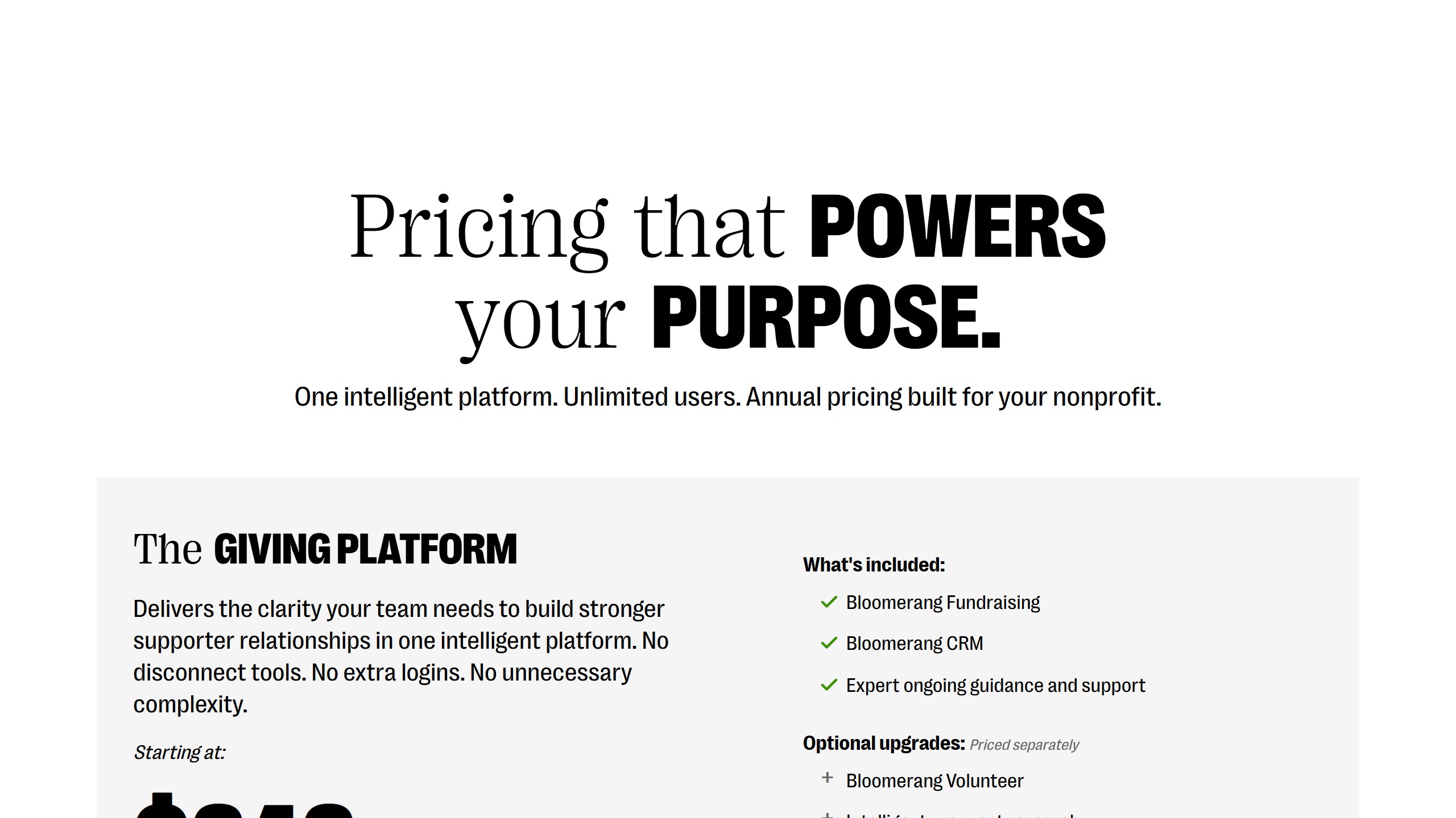
Little Green Light publishes every constituent band from $45 a month. Salesforce Nonprofit Cloud publishes $60 per user per month with ten licences free under Power of Us. Bloomerang publishes $125 a month for the CRM with other products priced separately. Keela publishes every contact band from $164 a month. Dataro publishes $15,000 a year plus ten cents per active donor on a page that is not linked from its own navigation. Blackbaud and Virtuous publish no figures at all.
What we do not do
We do not carry a figure we cannot source to the vendor. Where a number circulates widely and cannot be traced to a vendor page, we say so and withdraw it rather than repeating it with a hedge, and we have withdrawn our own published figures on that basis more than once. Where a vendor confirms an unpublished price directly to us, it is attributed as confirmed by the company rather than presented as a public rate.
Why every figure carries a date
Keela raised every band by roughly 15 to 22% in under two weeks in late August 2026. Neon retired an entire tier structure. A pricing claim without a verification date is not checkable, and in this market it is usually wrong within a year.
The bottom line
Boards do not need more fundraising information. They need less of it, arranged around what happens next and what they can do.
Three numbers, a pipeline by stage, what changed, what is at risk, and what you need from them. One page. Same shape every quarter. Sent in advance and not read aloud.
Use AI to assemble and to draft, which is where the two days actually go. Keep the projection, the risk judgement and the ask firmly human, because those are the parts the board is relying on you for.

Written by
FazFaz is the founder of AIToolsBakery. Some tools here are tested hands on. Others are assessed from vendor documentation and pricing verified on the live page, and every review says which one it is. Sponsors can buy a position in a guide. They cannot buy the score, the criticism, or silence about a better option.
How we test and how we make money →